Custom Design West Coast Island Homes
Showing posts with label contemporary architecture. Show all posts

20101005

Architecture and Excess: Reflections on the Recent Boom

Last week I attended a presentation by Shohei Shigematsu, a partner at the Office for Metropolitan Architecture (OMA) founded by Rem Koolhaas. The presentation was for a new cross-disciplinary arts building at the University of British Columbia that would be used by the schools of architecture, landscape architecture, and planning, among others. (I got my master's degree at the UBC school of architecture).

 Detail from OMA's Seattle Public Library

As a presentation for a new architecture building, Shigematsu's slideshow was disappointing. I was in a studio with Patricia Patkau (whose firm is one of the competitors of OMA for this project, as it happens) and one of the first things we did in that studio was study Rem Koolhaas's presentation for the Seattle Public Library. In both cases, UBC and Seattle, the purpose was not to present a design, but rather to show the firm's approach to design.

Detail from Patkau's Grande Bibliotheque du Quebec

Koolhaas's presentation in Seattle was a masterpiece of analysis and wit. His presentation showed that OMA would engage more deeply with the project than the other firms, and that this engagement would lead to a better building. OMA was of course chosen to do the project, and the resulting building is one of those rare successes that is admired by architects and the general public alike. The project also propelled OMA towards becoming one of the great architecture firms of the recent boom.

Shigematsu's presentation last week did not have the same effect. It was witty, and at times brilliant, but the attention paid to the UBC project itself was scant, and showed none of the intellectual brilliance of Koolhaas in Seattle. The overall impression was of a firm that has enjoyed enormous success, but is now perhaps not as hungry as it was, or should be.

The most interesting series of slides for me was Shigematsu's reference to the recent economic downturn, and the effect it has had on the architecture profession. Shigematsu is based in New York, and he said that unemployment among architects in the United States is 40%. This slide was highlighted by graphs of major stock indices such as the DOW and NASDAQ showing them falling off a cliff over the last few years.

Shigematsu then reversed the slide, showing the chart trending up dramatically, and called it a graph of architectural intellect, or something like that. The idea is that during these periods of unemployment, architects have time to think and publish, and the ideas they come up with will make for better design and fuel innovation in the next boom.

If only it worked that way.

No doubt it appeals to the vanity of architects that the brilliance of their work is related to the brilliance of their ideas. Certainly there are phenoms out there like Zaha Hadid, who spend years generating fantastic design before ever constructing an actual building. But architecture is ultimately about putting theory into practice, and practice means getting the building built. And getting the building built is much more likely to happen during a period of excess, like the one we have just been through.

Zaha Hadid's Maxxi Museum in Rome

What do I mean by "excess"?

I mean something very specific, and it comes from the theoretical works of Georges Bataille, in particular his line of thought about "The Accursed Share."

Anyone could tell you that works of significant architecture are more likely to be produced during times of prosperity. Large, extraordinary buildings are expensive, and require a lot of money, materials and labour. If you look at any textbook on architectural history, you can see that there is a one-to-one correspondence between "great architecture" and periods of great wealth. When wealth was accumulated in one place - historically through empire, but more recently through big business - some of that wealth was spent on extravagant buildings.

How Egypt spent its surplus

There is a significant counter to this, namely that the accumulation of that wealth, and the buildings that came from it, generally resulted from a lot of suffering. The theory is that the surplus used to create the buildings was produced by the labourers who made them. That surplus rightfully belonged to them, and not the emperor or mogul who commanded them to construct their monstrosity. Call this the marxist argument.

Another counter is that this only talks about "great architecture." What about buildings constructed on limited means, the vernacular architecture produced by ordinary citizens, who built from local materials and used ingenious means of crafting their dwellings to suit them to the local environment? Call this the sustainability argument. 

This is where Georges Bataille comes in. Bataille starts by flipping standard economics on its head by arguing that the central problem of human society is not scarcity, but surplus, or excess. The standard condition of human life on this planet is that we have adapted to our environment in such a way that we are capable of producing more than we need.

Bataille's favourite example is the native American potlatch. Periodically a successful elder would take his accumulated surplus and throw a ritualized party in which he would give away his excess goods to the rest of his family and his nation, even to his rivals. Why would anyone do that? Because the surplus has to be spent somehow, and it is ultimately an exchange: by giving it away, he receives prestige in return, and puts everyone into his debt.

How Chetzemoka spent the surplus

In other words, if the human condition is one of producing excess, we are then faced sooner or later with the problem of how to spend the extra that we produce.

Why would that be a problem? If we have more than we need, surely that is a good thing. It means that we can put some aside for later. We can re-invest the surplus, in other words. Or we can consume it and enjoy the fruit of our labour. We can throw a potlatch, and give it away to others. We can spend the surplus on taking care of the disadvantaged in our society, or taking care of the elderly and infirm. Yes, that's all true. However, re-investing the surplus only leads to a greater surplus, which at some point has to be spent. And consuming the surplus only leads to greed and waste. The ultimate wasteful expenditure is war: the large surplus that is built up is used to produce weapons and support and train an army of unproductive young people whose job is to destroy.

This is what makes the extra "share" that we produced "accursed."

This curse attaches to our labour whether we like it or not. Following the marxist argument, where each labourer gets to spend their own surplus instead of having it taken away by capital, all this means is that the choice of excess expenditure is smaller scale. At its best it means a broad producing-consuming class that spends at a great aggregate rate. At its worst it means that destruction is wrought by individuals or small groups instead of corporations or governments - by a terrorist cell or a well-armed militia instead of a national army. Surplus is a destructive problem no matter who spends it.

The fact that individuals are spending it does not make it less destructive. That is the central lesson of 9/11. The easy access to technology - whether it is planes that can fly into tall buildings, roadside bombs, automatic weapons in luxury hotels, or nuclear weapons in suitcases - makes it possible for individuals and small groups to wreak disproportionate damage.

(I will respond to the issue of sustainability and surplus in another blog post, because it's a big and, I think, really interesting topic. For now all I would say is that the idea of a surplus economy turns sustainability on its head, because sustainability is predicated on the idea of scarcity.)

Getting back to the economic boom of the last ten to thirty years, the signs of excessive consumption and destructive spending are everywhere. The lifestyle of the McMansion and SUV set, 9/11, the Alberta tar sands, the wars in Iraq and Afghanistan, the Beijing Olympics. This enormous economic bubble that we have lived through, when so many people and so many governments lived the high life for so many years, is in retrospect a litany of destruction and waste.

And then there is architecture.

I would argue that of all the ways to spend the surplus, architecture is one of the most appealing.

Perhaps the most succinct case to make for spending the surplus on architecture is to look at the past ten years in terms of the divergence in paths between China and the United States. Those two nations have produced and spent more wealth than any others in recent times, and they spent it entirely differently.

In the United States, Bill Clinton ran a budget surplus for the first time in generations, and he used it to pay down part of the federal debt. Then when George Bush came to power, he took that surplus and he spent it not once, but twice: first he gifted the surplus to the wealthy in the form of tax cuts and low interest rates, and then he spent it a second time in the form of two wars, an arguably necessary one in Afghanistan and an unnecessary one in Iraq.

Of course if you only have one surplus to spend and you spend it twice, you are going to have to pay for it at some point, and that is what we are seeing now, as the United States will be paying for the debts run up by Bush for many years to come.

 How George Bush spent one surplus

How George Bush spent another surplus

Then there is China. In 2008, the world witnessed perhaps the most extravagant potlatch in world history in the form of the Beijing Olympics. China announced its presence on the world stage as the next great superpower. The opening and closing ceremonies were spellbinding, the control exerted over the city and the populace was ruthless and astounding, the event ran like clockwork. Westerners could only look in awe, and console themselves by criticizing China's human rights or environmental record.

How China spent the surplus

Architects, however, couldn't help thinking about the buildings. The backdrop of every camera angle, it seemed, was framed by the work of a notable starchitect. The most famous of these was the Bird's Nest by Herzog and de Meuron.

Another building that showed up in fewer shots, but which was no less extravagant, is the one commissioned by the state television station in China, CCTV. This building was designed by Rem Koolhaas and OMA.
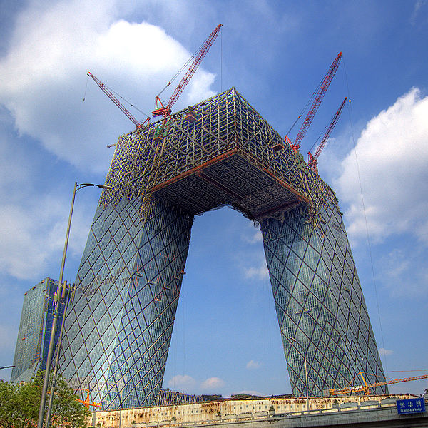
OMA's building for CCTV, under construction

Perhaps more than any other building, the cantilever on the CCTV building is so absurd that it can only be about one thing: excess. 

Like a potlatch, part of the purpose of the Beijing Olympics was to humiliate and to put others in debt. The West, and in particular the United States, is deeply in debt to China for other reasons. What the cantilever of the CCTV building says is something slightly different. It says: we are so wealthy that we can spend ridiculous amounts of money hiring your best architects to design utterly frivolous and unnecessary monuments, monuments so profoundly expensive that they could only be built in China, under our system.

The same archiecture firm that designed the CCTV building just presented to the school of architecture at UBC to build its new building. That firm, OMA, may send one of its partners to tell witty stories about the creativity of unemployed architects, but the reality is that OMA's built works are the product of a period of unprecedented excess, of employed architects being paid to create astounding design.

This is not a criticism. If you have read this far, I hope you will see the argument: that human society produces a surplus whether it wants to or not; that this surplus needs to be spent somehow; and that it is much better to spend it in the form of extravagant architecture than extravagant weapons systems. This is all fairly straightforward. 

What is less straightforward, and what I have no idea how to explain, is how it came to be that a ruthless, authoritarian government chose to shock and awe the world with the beauty of its buldings, while an advanced democracy faced with spending a similar surplus chose to shock and awe the world with the destructive power of its weapons.

20100823

New Photos of Cliff House


View of the house from the driveway.


View of the house from the southwest. The master bedroom cantilever is visible at the top.


The view from the master bedroom.

20091214

Cliff house deck in place

The deck at Cliff house has been installed. The deck cantilevers sixteen feet out over the cliff, supported by steel beams.

By avoiding touching the ground with columns, and allowing rainfall through a permeable cedar deck surface, this design intrudes less on the cliff wildlife below.

The subfloor for the main floor has been laid down, giving a good sense of the platform created.

The next step is to place the steel moment frame. Then the wood frame walls will go up and what looks like a construction site now will quickly take on the shape of a house.

The view from the deck is quite spectacular and a little vertigo-inducing, although that will change once the cedar decking goes on.

A bald eagle was on the lookout today further down the cliff. A good omen, if you're Roman.


20091125

Mount Pleasant Promotes Contemporary Architecture in Future Zoning Revision

The renewal of Main Street, together with the humming light industrial area of southeast False Creek, has made Mount Pleasant the creative centre of Vancouver over the last decade or so. Now Mount Pleasant is gearing up to add architecture to its leadership role in the City, as participants in the neighbourhood's Community Liaison Group have shown overwhelming support for contemporary and green architecture during a round of reviews of the area's residential zoning.

The City of Vancouver has received a lot of credit, some of it deserved, for its approach to planning in the City's core. The term "Vancouverism" popularized by Trevor Boddy has its own art exhibit extoling the City's success. In a nutshell, Vancouver planners pioneered a development model which offered density bonuses to developers who provided public amenities, a win-win that has led to a downtown that is the envy of most other cities in North America.

Less well-known is that Vancouver's planners have used a similar approach in the City's single family home neighbourhoods, except that instead of handing out extra density for public amenities, the City has given it to designers and builders for putting faux heritage facades on its houses. The City achieves this through a set of design guidelines which accompany the zoning bylaws. The design guidelines require the building permit application to include a streetscape analysis which compares the existing houses to the new proposed house.

For example, the single family zone RS-5 includes this image in its design guidelines, with the accompanying text: "Where a streetscape offers identifiable facade composition, a new house design should be derived from common patterns":


In other words, new houses should look like existing houses.

To make matters clearer, a further example is given which explains how the new house should be sure to incorporate period details: "A streetscape of houses of different styles and periods requires the designer of a new house to select some predominant context elements and compose these into a design which generally fits into the surrounding context":

In Mount Pleasant, which is an area with many heritage houses, this enforcement of periodized copying has meant that most new houses built in the neighbourhood have earned the name "faux heritage." In some parts of Mount Pleasant, faux heritage houses outnumber the original heritage ones they were intended to copy.

If a designer objected to this, they would be told that they could still build something different, but if so then they had to do it "outright," i.e., they had to build a smaller house. Since most clients wanting a new house, and practically all developers, prefer to build as large a house as possible, in practice that means that the vast majority of new houses are faux heritage. Lately, the requirement to build faux heritage has extended to the outright designs as well.

Why would the City believe that this is a good idea? To answer that question you have to look at Vancouver's history over the last thirty years or so. I would argue that the key moment arrived in the 1980s when Vancouver experienced an unusually high rate of immigration. At the time, there were no design guidelines, and new immigrants with enough money built large houses that looked different from the existing housing stock. Locals called them "monster houses" and proceeded to pressure the City into the creation of the design guidelines: if people wanted to build a large house, then it had to look like an existing house.

Vancouverites might not want to admit this, but the design guidelines are a clear form of architectural xenophobia. This is echoed in one of the comments from an earlier Mount Pleasant community liaison group meeting, in which one person wrote that there should be design controls in place to ensure that new houses are Edwardian or Victorian in style rather than "foreign looking."

In general Vancouver as a city has moved on from this xenophoboic moment and has become a cosmopolitan, outward-looking Pacific Rim city. Most Vancouverites don't just tolerate our multi-cultural diversity, we celebrate it and see it as one of the City's greatest strengths.

The xenophobic design guidelines, however, are still on the books.

This enforcement of antique design is an obstacle for local architects and designers who wish to pursue contemporary and innovative forms. It is particularly debilitating for the careers of young designers who usually cut their teeth on smaller buildings such as houses or laneway houses, but who are forced to produce dated designs.

Permit applications with contemporary design mean that the designer has to fight for approval or alter the design to meet the design guidelines. House builders, meanwhile, who are more concerned with square footage than aesthetics are happy to comply with the design guidelines if it means an easier passage through the permit process, which can otherwise be time-consuming. To make matters worse, many of the faux-heritage designs that are accepted use inexpensive techniques, such as slab-on-grade and engineered trusses, that were part of the reviled Vancouver Special and monster house repertoire, but which are now acceptable provided that they are hidden behind a periodized facade.

How refreshing it was, then, to attend the Mount Pleasant Community Liaison Group last Wednesday.

The group split up into three rooms, two for design of new houses, and one devoted to preservation of existing heritage houses. I joined one of the two design groups. I was ready to speak my mind, expecting to have to fight for contemporary design, only to discover that everyone in the room felt the same way.

This was graphically demonstrated when we were asked to put stickers next to ideas on the walls that we agreed with, and the most stickers were stuck next to sustainable design, followed by contemporary design.

Even more heartening was to sit in the full session following the design meeting, and discover that the other design group also felt exactly the same about the need to promote contemporary design, and to stop promoting faux heritage.

Everyone felt that existing heritage houses should be protected, and should be easier to designate as heritage. No one argues with the value of the City's architectural history. What people object to is the idea that architecture stopped in 1920, and that the neighbourhood should be frozen in time.

The thorny issue of how to incentivize contemporary and green design in Mount Pleasant still has to be worked out, and it will be tricky. But the first and crucial step has already been taken, and that is the rallying of this trend-setting community around the belief that contemporary architecture is important to the cultural life of the City and should be promoted.

20091002

Under the Zelkovas: Hitoshi Abe's Aoba Tei Restaurant


Take a bullet train an hour and a half north of Tokyo and you’ll find yourself in Sendai, a coastal city of one million known for its trees—and for one of Japan’s most intriguing young architects, Hitoshi Abe. What makes Abe so intriguing is that he continually reinvents his design process, making each project uniquely itself: a football stadium takes on the contours of the surrounding hillside; the rooms of a private art gallery are sized according to its collection and arranged like soap bubbles in a box. Across the street from Toyo Ito’s celebrated Mediatheque in downtown Sendai is Aoba Tei, a French restaurant specializing in beef tongue. The interior of the restaurant is designed by Abe and takes its cue from the double allée of zelkova trees lining the boulevard outside. The architect has employed a sophisticated technique to achieve an extraordinary effect, as the space within the restaurant conveys the experience of being under the zelkova canopy directly outside. Though small in scale, the project is one of those key works that engages significant changes taking place in the field. Aoba Tei places Abe at the forefront of a conversation taking place in architecture about the use of 3d modeling to create complex surfaces­, while at the same time the restaurant embodies many of the qualities of older Japanese architecture, before the country opened up and began its mad dash towards modernity.

Entrance to Aoba Tei Restaurant

It is worth looking at that trajectory in order to understand where Aoba Tei’s ideas came from and what makes it so interesting.

The story is perhaps best told by pop artist Takashi Murakami, who describes postwar Japanese art as a progression from flat to superflat. Under America’s influence, Japan became a flat society. Traditional hierarchies dissolved in the new democracy and the middle class expanded to make Japan a nearly classless capitalist economy. In this media-driven age, flat cultural products predominated: billboards, magazines, TV and movie screens.

Postwar Japanese architects meanwhile adopted modernism, a movement whose flat ideals of universality and mass affordability suited the country’s urgent need to rebuild. Tadao Ando and others did for reinforced concrete what Kobe did for beef (and much else besides): they imported something that did not exist in the country before 1868 and raised its quality to the point where the West now copies Japanese techniques. Here and elsewhere, this boxy architecture derived in part from a design process rooted in flat formats. Orthographic projection, the use of plans and sections flattened onto paper and computer screens, tended to produce buildings composed of planes arranged at 90 degrees to each other.

As the economy took off, it was the otaku (geek) subculture that produced the country’s most commercially successful cultural products: manga, anime, Nintendo. Takashi Murakami’s work is a sendup of this trend, flat culture taken to its logical conclusion: superflat. Like Andy Warhol, Murakami’s work is at once a celebration and a critique of the flattening of high and low art, of art and commerce. His signature style, brightly coloured kawai (cute) figures, has found its way onto Louis Vuitton handbags.

Superflat Japanese architecture arrived in the 1970s with the metabolist movement, which proposed that buildings are living cellular organisms that can evolve over time. Its best known product is the Nakagin capsule tower, which is composed of small replaceable concrete units attached to a permament spine.

Nakagin Capsule Tower

Today the lines of superflat art and pop architecture converge in Tokyo at Shibuya, with its building-scale jumbotrons, or in the maid cafes of Akihabara; it can certainly be found at the love hotel Adonis in Osaka, where for ¥950 patrons can spend half an hour in kawai intimacy in the Hello Kitty room.

Shibuya, Tokyo

Hello Kitty Room Info Screen

It might seem as though Japanese culture has long since left behind its austere roots. Yet superflat art and modernist architecture fluorished in Japan in part because they resonated with certain design qualities of the past. Manga and anime are direct descendents of ukiyoe and kabuki, while in architecture, modernism has much in common with tatami-era buildings: asymmetrical composition, minimalism, and a modular building system. There is a line of artistic thought that can be traced directly from Edo to the accelerated culture of contemporary Tokyo.

Tea Room at Daitokuji Temple

Still, there are other qualities in traditional Japanese architecture and landscape design that have fallen into disuse in the process of modernization. These qualities are most evident in the temples and gardens of Kyoto, which was spared the bombing, but can be found throughout the archipelago, often in the rural, slower parts of the country.

Rock Garden with Tourists, at Ryoanji Temple

It is difficult to point to any one thing that produces the effect of traditional Japanese design because the different elements work so well together. The natural materials—dark wood, thatch, straw, rice paper—engage the senses. They limit light, reduce contrast, and have an earthy aroma. They are well-adapted to the climate, expelling heat and repelling water in the humid summer and rainy fall. In the winter, heating comes from a hearth sunken in the floor, which is used for cooking and serves as a social focus. The straw tatami mats are sized to the body, creating a human-scale module for room sizing, rooms that are often kept deliberately small to foster intimacy. The transition from outside to inside is measured, with deep eaves and long verandas, while the view from inside to outside is often carefully framed.

For novelist Junichiro Tanizaki, whose 1933 essay In Praise of Shadows laments the passing of traditional Japanese aesthetics, the key element binding everything else together was light:

Our ancestors, forced to live in dark rooms, presently came to discover beauty in shadows, ultimately to guide shadows towards beauty’s end. And so it has come to be that the beauty of a Japanese room depends on a variation of shadows, heavy shadows against light shadows—it has nothing else.

The aesthetic system does not stop at the building materials. Tanizaki cites a lacquer bowl, which in electric light looks garish, but which in the dim shadows of a Japanese room takes on a lustrous depth.

Modern materials and lighting make this kind of effect difficult to achieve. Even in a modern masterwork such as Tadao Ando’s Church of Light, which lights the nave by cutting a glass cross out of the concrete behind the altar, the transition is too sudden, too high-contrast to achieve the gravitas of traditional Japanese space.

Tadao Ando's Church of Light

Yet while it may be hard to set the mood, as anyone who has sat down to contemplate a rock garden knows, the tranquility can be broken by just about anything. By the busload of school children filing past. By the tinny music playing on the loudspeaker behind you. By the fellow next to you snapping photos with his mobile phone. The rocks don’t seem to have an answer to any of this other than to sit there, enigmatically, photogenically. As solemnly beautiful as these places are, there is an incongruity to them as well, as if they find the modern world a bit trying.

Returning to Hitoshi Abe, the genius of his design for Aoba Tei is that it evokes the mood of older Japanese architecture while being at ease with the gadgetry and pace of the times. The compressed, shadowy space transitions seamlessly from the from the leafy boulevard to the dining room. Sitting in the restaurant under the pixellated Zelkovas sets up a view of the trees outside. The effect is highly place-specific, not just to Japan, but to this particular spot in Sendai. Move Aoba-Tei three blocks in any direction and it would lose much of its power.

Sendai's zelkvovas during the festival of light

The zelkovas on the interior of Aoba Tei restaurant

The making of this effect is just as interesting. The tree images were made from digital photos taken inside the zelkova canopy. The photos were then pixellated and applied to a surface designed to wrap the interior of restaurant, a process known in 3d game development as texture mapping. The difference is that Abe has brought this technique to life, drilling holes of varying sizes in sheets of steel, which were then shaped by marine welders to match the 3d model. When backlit, the trees render as pixellated outlines of limbs and leaves, enveloping the diners in a variation of shadows much as the zelkovas do the pedestrians outside. The likeness is even stronger during the winter Festival of Starlight, when the bare zelkovas are lit with strings of white lights.

3d rendering of zelkova trees outside Aoba Tei

One pixelated zelkova

Rendering of interior steel shape inside Aoba Tei

Steel shape with pixelated trees punched out


Steel shape inserted inside restauarant


Rendering of final street scene outside restaurant


Rendering of interior of restaurant looking out at zelkovas

Though modest in scope, Aoba Tei is one of the better examples of an important shift taking place in architecture. Innovation in the field has always been fueled by technology. If modernism was the working out of the logic of new building materials­ —concrete, steel and glass—what we are seeing now is the logic of the computer. Abe’s design relies on perspective, a view that defies measurement, or did, before the advent of 3d modeling. Where 2d drawing led to boxes, 3d modeling is just as happy with angles and curves. This development has had a surprising effect: the computer, which was supposed to distance the designer from the haptic qualities of building, has instead in the right hands brought a new sensuousness to architecture.


While technologically sophisticated enough to accommodate the inevitable mobile phone, Aoba Tei is also a place where the lacquerware would show its beauty. It seems fitting though that the restaurant is international, with its chef having trained in France and its architect in the United States. Perhaps most globalist of all is the use of 3d modeling, a technology that has spread across the arts and around the world, but which Hitoshi Abe has used here to create a very local, and very beautiful space. As for the beef tongue: that is a matter of taste.

20090914

Vancouver Laneway Housing: An Unfinished Project


The City of Vancouver recently approved its Ecodensity initiative, which includes a provision for laneway housing in single-family zones. This is a welcome and progressive move by the Council, since it adds density, and all its benefits, to the least-dense parts of the City. Metro Vancouver is expected to double in population before the middle of this century, and all those new people need to live somewhere. The general view is that laneway housing adds density without disrupting the granular building pattern that makes these neighbourhoods so desirable. The fact that the City was able to increase density in areas that have traditionally been reluctant to allow it is a sign of how appealing laneway housing is.

What Vancouver failed to do, however, is apply the obvious appeal of laneway housing to other appropriate parts of the City, in particular two-family zones. The thinking seems to be that two-family zones in the City already allow laneway houses in the form of infill housing, so including these zones in the Ecodensity initiative was unnecessary:

Current City regulations already allow one type of laneway housing. These are zones in which lane houses are placed over garages, in order to provide the required parking. They are generally on larger lots (50 ft or more) in areas zoned to have duplexes, conversions, and other similar development in addition to laneway housing. Although the main house is often retained, both the main house and the laneway house are part of a site redevelopment by small scale developers, with units in both buildings sold through strata titling. This zoning is very suitable for, and successful in, some parts of the city and could possibly be expanded to other locations. Ecodensity Initial Actions (p 18)

The reality however is that infill laneway houses are nearly impossible to build in these two-family zones because of an overly-restrictive set of design guidelines. In Vancouver, many parts of the City have both a set of zoning and development bylaws, which are legal documents passed by Council that determine what can be built where, as well as policies and guidelines, which are less rigorously written and enforced, but which have significant influence on the outcome of development proposals in the City.

In most two-family zones in Vancouver, there is an infill design guideline on the books that limits what can be built. The stated objective of infill is "to retain existing buildings by allowing the construction of a second residential building on appropriate sites" (p 11). The restrictions provided in the design guideline however make laneway infill nearly impossible. These restrictions include:
  1. Separation between existing and infill building of 4.9m (16 ft)
  2. A rear yard area of 195 m2 (2100 sq ft)
  3. Infill building maximum height of 7.7m (25 ft)
  4. Rear yard site coverage of less than 35%
  5. For mid-block infill, a side yard adjacent to the existing building of 4.9m (16 ft)
This is what that looks like:


The first four restrictions make laneway infill doable on many lots, provided the existing house is relatively small and forward in the lot. However the last provision, the side yard setback, effectively kills laneway infill as a popular option. The reason is that most Vancouver lots are either 33 feet or 50 feet wide, while houses are rarely less than 25 feet wide, and are usually placed near the centre line of the lot. For a 33 foot lot, that typically leaves 8 feet of side yard, divided between two sides, while a 50 foot lot has 25 feet of remaining side yard. So 50 foot lots are a rare possibility, provided the original owner built a narrow building and located it off to one side, but 33 foot lots are out of the question.

In other words, the objective of the infill design guideline is supposed to encourage the retention of existing buildings, but the guideline's own side yard setback makes this nearly impossible. In practice, this means that the vast majority of developers of these lots demolish the existing building and construct a new duplex. (Many of these new duplexes look like character buildings, but in fact are built slab-on-grade, i.e. without basements, and without attics, much like the cheap Vancouver Specials that preceded them). This is the first irony.


The second irony is that many of the two-family zones in the City are meant to be heritage-friendly zones, which promote the preservation of character and heritage houses. Since it is largely impossible to build infill, and very costly to renovate or expand an older building, most developers will demolish the existing house, and then design the new duplex in a faux heritage style in order to get a density bonus that allows for greater floorspace. Result: character is being replaced with faux character.

The final irony is that these new duplexes are then required to have a two-car garage on the lane, a parking requirement that is meant to reduce crowding on the street. (Never mind that many duplex owners park on the street anyway, and use their garage for storage.) This required garage ends up being about the same size as the infill laneway house that the design guidelines originally prevented.

The question, then, is what is the point of these design guidelines that prevent infill laneway houses in two-family zones?

Perhaps it's because the municipal infrastructure cannot support the added density? Not true: the allowed duplexes add the same load to the infrastructure as the disallowed infill. And anyway, the numbers for family sizes and residents per building have been falling in Vancouver for decades.

Perhaps it's a matter of safety, i.e. the 16 foot side yard setback is the distance required to get emergency fire and medical services to the infill unit to the back of the lot? Again, not true: the BC Building Code only requires 3 feet for emergency access, which is the setback required for laneway housing in the new ecodensity initiative, and anyway, the lot can also be accessed from the lane.

No, the reason for the 16 foot side yard setback is that whoever wrote the guideline decided that it looked nice. To make that clear, they included this picture in the guideline:


At the time of writing, the City felt that all of the dwellings should be visible from the street. Notice, too, that the laneway house matches the main house to a large extent in terms of style. There is an idea here about the character of the streetscape and the granularity of building pattern relative to open spaces. A couple of questions come up immediately, however.

The first question is: why does this idea of streetscape trump all of the benefits of sustainable urban growth identified in Ecodensity? Laneway housing has proven to be the most visible and popular aspect of the Ecodensity initiative, with very little concern shown for the fact that these small new laneway houses will be hidden behind the existing homes. The answer must be that when the guidelines were written, the sustainable nature of laneway housing was not well-recognized; in other words, the design guideline is obsolete in today's thinking.

The second, and to my view larger and more interesting question, is: why are the City's planners trying to design houses? This is not their job. There is a point where design guidelines cross the line from being general regulations concerning safety and massing of buildings, and into the territory of individual building design. The former is a fair matter of concern for City planners, but the latter is a matter for architects, house designers, developers, owners and their neighbours.

Here and elsewhere, the City of Vancouver has attempted to quantify certain characteristics of older homes in the City, and has developed a set of incentives to encourage developers to build new buildings similar to those old forms. This is a large topic and worthy of a blog post of its own, but for now I will say that I am not alone in feeling that this encouragement of faux heritage new construction is turning the low-density parts of Vancouver into a theme park of kitsch architecture.

It is especially confounding when a kitsch design idea such as the side yard setback for laneway infill ends up encouraging the demolition of the very character homes that the new kitsch houses are meant to emulate. Yet this is what is happening throughout two-family zones.

The City Council showed admirable insight and gumption when it recently passed the Ecodensity initiative. That initiative effectively fast-tracked a slow and tedious neighbourhood-by-neighbourhood revision of zoning bylaws in order to allow small laneway houses in single family homes. Some zones, including Cedar Cottage, have already jettisoned the restrictive design guidelines that prevented laneway infill housing, while other two-family zones, such as Mount Pleasant, are attempting to do it one by one, as part of the regular neighbourhood rewriting process. The City should now show the same pluck and fast-track laneway infill housing for two-family zones.